Last Update: June 21, 2022
ARIMA Models Identification: Correlograms in Python can be done using statsmodels package plot_acf and plot_pacf functions found within its statsmodels.graphics.tsaplots module for identifying ARIMA models autoregressive and moving average orders. Functions plot_acf and plot_pacf are used to visualize autocorrelation and partial autocorrelation functions correlograms. Main parameters within plot_acf and plot_pacf functions are x with time series data, lags with correlogram number of lags and alpha with correlogram confidence interval statistical significance level.
As example, we can do training range univariate time series ARIMA(p,d,q) model autoregressive p and moving average q orders identification with autocorrelation and partial autocorrelation functions correlograms using data included within datasets R package AirPassengers object [1]. Notice that we need to evaluate whether level or d order differentiated training range univariate time series is needed for ARIMA model integration d order.
First, we import packages pandas for data frames, statsmodels for data downloading and autocorrelation, partial autocorrelation functions correlograms and matplotlib for training range and autocorrelation, partial autocorrelation functions correlograms charts [2].
In [1]:
import pandas as pd
import statsmodels.api as sm
import statsmodels.graphics.tsaplots as tsp
import matplotlib.pyplot as plt
Second, we create mdata model data object using get_rdataset function, convert mdata object into a data frame using DataFrame function and display first five months of data using print function and head data frame method to view time series structure.
In [2]:
mdata = sm.datasets.get_rdataset(dataname="AirPassengers",
                                     package="datasets",
                                     cache=True).data
mdata = pd.DataFrame(data=mdata["value"]).set_index(
    pd.date_range(start="1949", end="1961", freq="M"))
print(mdata.head())
Out [2]:
            value
1949-01-31    112
1949-02-28    118
1949-03-31    132
1949-04-30    129
1949-05-31    121
Third, we delimit training range for model fitting as first ten years of data and store outcome within tdata object. Then, we delimit testing range for model forecasting as last two years of data and store outcome within fdata object. Notice that training and testing ranges delimiting was only included as an educational example which can be modified according to your needs.
In [3]:
tdata = mdata[:"1958-12-31"]
fdata = mdata["1959-01-01":]
Fourth, we view training range data with plot, ylabel and xlabel functions. Within plot function, training range data object is included. Within ylabel and xlabel functions, vertical axis label and horizontal axis label strings are included.
In [4]:
plt.plot(tdata)
plt.ylabel("Air Passengers")
plt.xlabel("Year")
plt.show()
Out [4]: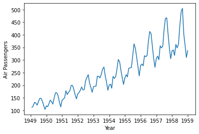
Figure 1. Training range data.Fifth, we do training range time series autocorrelation function correlogram chart with plot_acf function. Within plot_acf function, parameters x=tdata includes training range data object, lags=24 includes correlogram with twenty-four lags and alpha=0.05 includes correlogram confidence intervals with five percent statistical significance level. Notice that plot_acf function parameters were only included as educational examples which can be modified according to your needs. Also, notice that we need to evaluate whether Bartlett formula is needed for correlogram confidence intervals estimation.
In [5]:
tsp.plot_acf(x=tdata, lags=24, alpha=0.05)
plt.show()
Out [5]: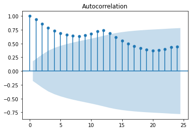
Figure 2. Training range time series autocorrelation function correlogram.Sixth, we do training range time series partial autocorrelation function correlogram chart with plot_pacf function. Within plot_pacf function, parameters x=tdata includes training range data object, lags=24 includes correlogram with twenty-four lags and alpha=0.05 includes correlogram confidence intervals with five percent statistical significance level. Notice that plot_pacf function parameters were only included as educational examples which can be modified according to your needs.
In [6]:
tsp.plot_pacf(x=tdata, lags=24, alpha=0.05)
plt.show()
Out [6]: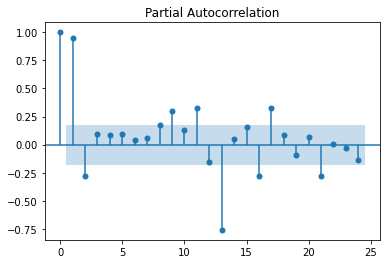
Figure 3. Training range time series partial autocorrelation function correlogram.Seventh, we do training range time series ARIMA(p,d,q) model autoregressive p and moving average q orders identification.
- If autocorrelation function ACF correlogram tails of gradually and partial autocorrelation function PACF correlogram drops after p statistically significant lags then we can observe the potential need of an autoregressive model AR(p) of order p.
- Alternatively, if autocorrelation function ACF correlogram drops after q statistically significant lags and partial autocorrelation function PACF correlogram tails off gradually then we can observe the potential need of a moving average model MA(q) of order q.
- Otherwise, if autocorrelation function ACF correlogram tails of gradually after q statistically significant lags and partial autocorrelation function PACF correlogram tails off gradually after p statistically significant lags then we can observe the potential need of an autoregressive moving average model ARMA(p,q) of orders p and q.
References
[1] Data Description: Monthly international airline passenger numbers in thousands from 1949 to 1960.
Original Source: Box, G. E. P., Jenkins, G. M. and Reinsel, G. C. (1976). “Time Series Analysis, Forecasting and Control”. Third Edition. Holden-Day. Series G.
Source: datasets R Package AirPassengers Object. R Core Team (2021). “R: A language and environment for statistical computing”. R Foundation for Statistical Computing, Vienna, Austria.
[2] pandas Python package: Wes McKinney. (2010). Data Structures for Statistical Computing in Python, Proceedings of the 9th Python in Science Conference, 51-56.
statsmodels Python package: Seabold, Skipper, and Josef Perktold. (2010). “statsmodels: Econometric and statistical modeling with python”. Proceedings of the 9th Python in Science Conference.
matplotlib Python package: John D. Hunter. (2007). Matplotlib: A 2D Graphics Environment. Computing in Science & Engineering, 9, 90-95.